How Far We've Come - Dev/Design Diary #001
- Parker Hughes
- Aug 21, 2023
- 6 min read

David's Dev Diary
An Introduction to the Album
No one ever said it would be a good idea to start recording a developer’s diary 8 months into a project, but no one told me we’d work on it long enough to need one either. Damion and I started working on Fella’s Figments right around Thanksgiving of 2022 as a fun side project to experiment with 3D game programming, but the side project eventually grew out of being just a fun hobby and with every git commit, it felt more and more like a real game. So, as any good indie developer should, I suppose it’s a good idea to start writing down our thoughts and progress.
The Scope of All of This Rebuilding
We were naughty and didn’t follow the Valve/Nintendo strategy of Playtest early/Playtest often. We’re not a huge, experienced game company and convincing people to play a game you’ve worked on turned out to be harder to do than I expected, let alone getting the necessarily blunt criticisms games need to grow into something worth playing. Luckily, we’ve stumbled upon a few experienced game designers who were willing to lend us their critical feedback. Like a good boy, I took it in stride and took a month off of level design and took the menuing system back to the drawing board.


There were quite a few issues with this layout. The focus highlights were not very clear and higher resolution it was practically impossible to tell what you were about to click on. To make matters worse, nested tabbed containers don’t work super well unless you’re using a mouse to navigate your menus. I wanted to make things compact and maintain high information density, but it came back to bite me as controllers are inherently designed to navigate as small a dataset as possible (Looking at you, modern Ubisoft games). I took some steps to fix this, and step one was some JUICE.
Updated UI Demonstration
(Logo placeholder, if you know someone that can help there hit me up)
I wanted to make things as clear as humanly possible. After a lot of research (playing video games) I came up with a new design (copied Mario Odyssey) that I feel really nails ease of navigation, feels good to navigate and still conveys all the information players need to know.
In Framing
I feel as though I’ve walked away from this exercise in humility with an excellent lesson. I am significantly happier with the new menu, and instead of hammering away at a broken system I was able to move on and build something better. I’m looking forward to our first round of public testing to hear what more people think of the game come October.
Dame's Design Log
Hello Strangers and Friends!
Welcome to the very first Design Log for Fella’s Figments. If you are reading this, then you hereby have the right to refer to yourself as an OG. A real Day One-er; with us since the dawn of the Fellaverse. Thank you for the support! Now with that out of the way...
Let’s talk shop. This log is going to serve as a running braindump of SCS’ game design thoughts and process. Any important ideas that we have on what makes platformers fun, or what makes a good level will get synthesized down from frantic Discord thoughts to something a bit more palatable. Comments will (should?) be enabled on these, and I’ll check up on them if there’s any traction. Hopefully we can partake in some good ol’ chin-wagging - should be a good time.
Back to Basics
Let’s face it, when David and I kicked this project off in Fall 2022, my experience in game design was minimal; scattered thoughts from a myriad of one-off undergraduate courses. However after hours of slamming my fingertips into Godot and Blender, one starts to remember an old adage - something to the tune of “work smarter, not harder.” With this in mind, every level I now design (after the initial setting/style brainstorm) starts like this:

With just a couple of circles, lines, and labels. Functionally, this is what will become our demo level, at least as it was initially imagined. Each of these nodes represents an objective, a gate, or a key. 1 is the first collectable, and 2 and 3 follow. “A” opens the locked “A” door, and likewise for “B”. Start and Ex, are the entrance and exit, respectively. Both the graph and the level it represents are quite simple, but the idea of representing features of your level, without knowing what it will look like or how it will play, as a series of nodes and paths can be applied to the design of any genre’s playable spaces.
The point of this graph is to build the foundations of the level, in a non-committal, and easily adjustable way. When you start with a blank Blender project and a vision, I have found it to be all too easy to miss the forest for the trees, and hyperfixate on small fragments of the level rather than building a cohesive world for the player to explore. I found myself spending hours working on micro-adjustments, while disregarding the fact that what I was working on was boring, not fun, unnecessary, too hard, etc. When properly building a foundation, like the graph above, I could then open a blank Blend file and at least have some understanding of how I want the level to flow.
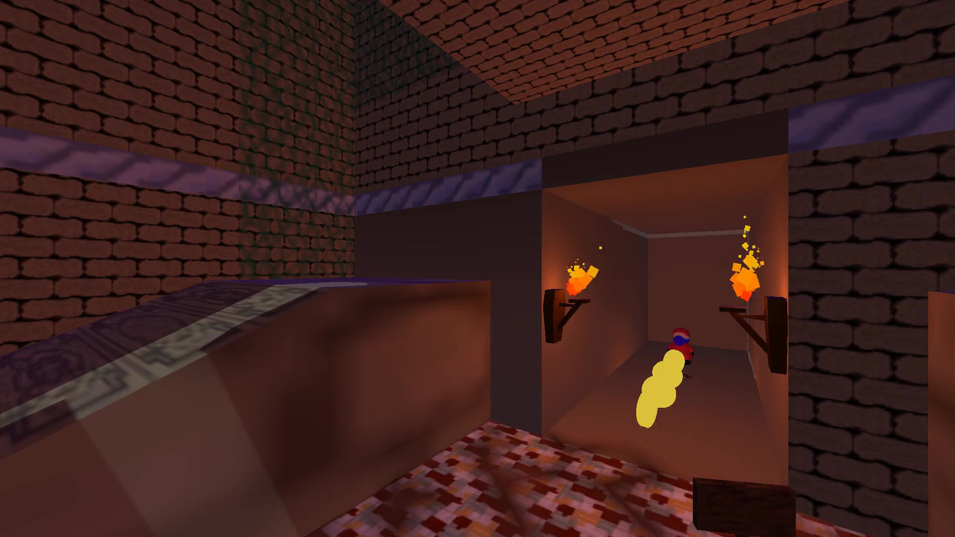
Refinement of The Temple
This led to the very first iteration of The Temple, a level we have built to showcase our friend Fella for our upcoming October demo.

Ignoring the placeholder textures and the shoddy lighting, this first take on The Temple had a lot going for it, but it also left quite a bit to be desired. One pro, it was a level! That’s pretty cool! Thanks to the work put in at the beginning, I knew I was building a level that would have an intended flow, where a player could actually get to the end and beat it. And aside from a few modifications that teased themselves out while playtesting, we were satisfied with that flow. The graph had been a success.
However, there were a few glaring issues at this stage. For one? The opening room, intended to be a space for players to experiment with learning the controls, was brutally difficult. It required chaining together 2 different movement mechanics, without ever learning they exist, just to get to the “real” level. Each playtester, beginner and advanced, that I had play the level at this stage got stuck in the opening room. Secondly, whenever I’d help the new players by moving them into the center room, it was boring, and way too easy compared to the challenge prior.
This feedback became clear through repeated playtesting. When I had practiced this on my own, I had no problem executing the Spin Jump to Dive movement. But to newer players, who’d never even known it was possible, the challenge was insurmountable. Through repeated attempts at designing fun platforming (and plenty of “studying” Super Mario 64) we realized that sometimes, an obstacle can be quite easy to overcome. In fact, you need easy tasks, to make the hard ones feel like a challenge at all! With this in mind we gave another pass through to various parts of the Temple. Along with parallel progress in graphics and assets, the level really came to life. See below some of the changes we made and what motivated them.
Before and After
Entry Room
Before:

After:

Change Overview:
We wanted to overhaul the Entry Room so that it was an easier challenge technically, but still required the player to do something in order to access the main level. To do this, we replaced the impossible jump with a series of falling platforms, designed to be easy enough to complete on their own. In addition, we added a button-activated door, blocking the player from going straight through. First, they had to climb some vines and push a button, to ensure that if you’re in the main room, you’re comfortable with those asks.
Main Room
Before:

After:

Change Overview:
Before, we’d just had small, sliding platforms that would lead the player to the next part of the level. However, they were tedious to jump across, and bored players who kept falling. Remedying this was quite simple. We knew we wanted to feature moving platforms over safe ground, because later in the level the player would have to take similar platforms but over a pool of hazardous lava, and they should be prepared. So, we made the platforms much larger, reduced the number of them from 4 to 3, and tuned their speed and initial positions. This simplification allows players to efficiently traverse the level, and, similar to the last example, plants seeds for the more challenging puzzles that await...
In Closing
Designing our first completable level has been a labor of love, and a great way for us to begin understanding what kinds of level design workflows work well for us. Even just going through the old commits to grab screenshots for this blog post, I can feel the improvement in the intentionality and flow of what is asked for the player. Up next we are beginning on a larger level for another showcase, and with that will come more posts. I’m looking forward to writing these while working through the level design process, and not at the end as I have for the Temple. Oh, and check out the demo coming in October!
A Bientôt,
Damion
Comments